News - 1 Best Warzone Mobile Settings (hud. Sensitivity)

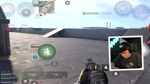
These are the best settings for War Zone Mobile in 2024. Now let's hop into the settings. First off, the HUD Okay, and boom, this was my HUD. As you can see, it's pretty straightforward; it's really like your Call of Duty Mobile H. If you already have an account, I would just use that same template and apply it to your War Zone mobile HUD.
Each person's going to have a slightly different HUD because each person's device is different; their finger size is different; what's comfortable for their hands is different; so honestly, you just really have to customize and find your preference. I'll give you a few samples of a two-finger, three-finger, four-finger, five-finger, and six-finger HUD just so you have different ideas in case you're not sure what to use and you're a bit lost on some important keys inside of a HUD.
First off, with the mini map, you can actually change it, so if you go to variants, you can make it round or can make it Square Personally. I like Square because you can see more, you can rotate your map as you turn your screen, and the map will turn with you, or you can disable it so it stays fixed.

I like mine unenabled because it makes it easier to see where everybody's coming from and what's going on. As for your actual weapon slot, if you go to variants here, you have three different options. You have multi-gestures, minimalist, and classic; I personally prefer the multi-signal just because it simplifies the HUD.
All I do is put it on the ammo as integrated, so instead it'll be up top, and that's just more clutter on your screen, which you don't need, so I recommend you go to integrated for Alo Fire type. This allows you to switch between single-fire shots and full auto. I recommend putting it on gesture so you don't accidentally click the single fire.
Auto now, let's go to the equipment. If you have it on direct throw, as soon as you tap it, it'll throw; if you hold it a little bit, it'll hold on; and then when you let go of the hold, it'll throw as well. I really recommend this because it's way faster and it gives you way more versatility. By default, you would just have to equip it, cook it, and then throw it.

It's just more steps, which you don't need. Now for the Crouch button, you can either have it merge or split. If you have a split, you can have two different buttons: a drop-shot button and a crop button. I always had mine on merchandise in Call of Duty Mobile, so just a personal preference here.
Now for your aim-down site, definitely just have it as a button. You don't want to have to double-tap every time you enter and exit an ad; it's just unnecessary. Now if you go to the bottom right, there's HUD presets. You can go ahead and choose some of the different HUD layouts that they have for you.
This will give you some versatility if you don't know how to start, but those are a bit more basic, and I think you should create your own to be much more comfortable for you now, as for your ads. I would just keep these both off; it'll make it the most optimal, in my opinion. Next up, if you want to go ahead and use manual fire, that's the best setting, so you can control when you want to actually get into an engagement or not, as for automations.

I have mine on custom; you can turn it on and off if you'd like. If you want to restore your default settings, you can just press restore. If you want to broadcast it, I believe that's to share it, and once you have the code there, you can share it with people so they can go ahead and actually apply it to their settings.
Now, if we go to gameplay play, the first automation is Automation is mainly for beginners, so whenever you're walking over weapons, different equipment, or handguns, it'll basically pick them up automatically for you. In the beginning, when you have weapons, it won't do that; you'll have to select them manually.
Some people auto-pick up by class, so you can then prioritize whether you want to pick up an AR over an SMG or an LMG over an LMG. Now for damage assistance, I personally have it off. What happens is that whenever you're getting shot at, it'll help you turn to the person who's shooting at you a little bit more precisely.

I keep it off just because I want full control of my actual person's POV. I have loot auto-pickup for br. As for auto-equipment armor, this is not good. You should definitely have it off because whenever you're low on armor or whenever you walk over armor, it'll automatically equip it if you have room for it to be equipped.
And I've tried this before I went into some gunfights and because I was low on armor. It would just auto-equip a mid-gunfight, and it would just mess me up a lot, so turn that off as for the virtual stick. Behavior: definitely put it on analogy; you do not want to always sprint; you want to have the ability to walk.
Sprinting to stand is helpful because if you're crouched or prone, if you just literally move up with your joystick, it'll help you get out of that much easier. Camera rotation is really a personal preference; I personally like accelerated because if I swipe faster, my character's camera will move faster versus fixed.

The exact amount you swipe on your scream is the exact amount you'll turn, so it's a lot more consistent feeling, but accelerated if you get used to it gives you a lot more speed and reaction time. Turning off the throwback allows for rotation. Off, not needed weapon Mount movement exits, so whenever you're in a weapon mount and you literally just move it, it can.
When it's on, it'll exit you; if it's off, it won't. You'll have to click the button to auto-off mental again. As for the exit delay, keep it short. There's no reason to have a medium or long weapon trigger. Keep it on manual so you can control it when you're shooting. Auto-fire and objects definitely not again.
This is all about getting full control over your character, so nothing is done in a way where you don't want it to be done. That's where I would put it on tap. I just like it way better because it'll fire the gun immediately, whereas if you have it on release, you have to hold it down and then release it for it to shoot, and that's just way too slow.

Aim down sides when firing; sometimes you need a hip fire, so this is really important. Keep that up. This is my personal preference: snap ads, fire button to finger. I don't think you should keep it on; at least that's not what I would do automatically. Melly I do not think you should do this when you're having a close encounter, and your character will just auto-punch.
This can be helpful, but really, it's better to just stop shooting most of the time, and if you really do want to punch him, you have a separate button that you can use to do that with a sprinting door bash. Yeah, I really like this. You can just sprint through doors instead of having to open them; it's just much faster.


