News - Warzone 2: 10 Secret Changes You Weren't Told About. Season 1 Reloaded Stealth Changes
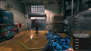
Without them obstructing you and getting in your way, those are now gone entirely, and you can move freely in front of that counter. And from the very beginning of the game, which is awesome, that was one of those things that was just a very small map detail that just infuriated me any time I played Terminal, but it was nice to see that removed.
Faction icons in season 1 reloaded
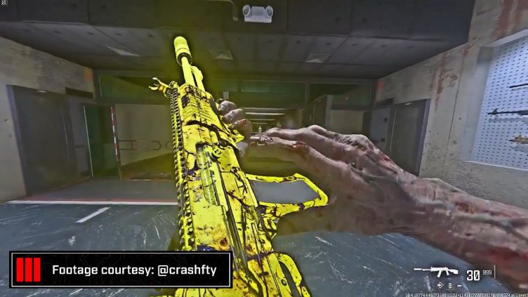
Here, faction icons now appear more prominently on the infill sequences.
Camo changes in modern warfare 3 season 1 reloaded
And weapon canvases for camos have actually been adjusted on not all of them, and it seems like it might be limited to some blueprints, but I noticed them on the black cell weapon blueprints that I had—maybe all black cell blueprints, but at least a couple of them that I had equipped.

You guys may have seen the one gameplay where I sniped earlier in the season where the camo was an all matte black finish on my sniper, that was the secondary design of the black cell blueprint, with the mix of the finish of A ranked camo that applied to the entirety of the weapon because of the way the black cell blueprint worked, whereas now I'd say over half that weapon now showcases the base primary camo pattern of the emerald green ranked camo that in my black cell MCW blueprint that I know I had was something that was an all snow white camo effect because of the way the CDL 2023 camo worked with a black cell blueprint. But now you can see that it's actually adjusted to the point where it's no longer the case here, so I'm not sure how many of these have changed, but I did notice a few of these weapons; maybe you have as well.
New ui changes in modern warfare 3 season 1 reloaded

Now moving along to the final portion of this article, some smaller and less consequential items.
Things, but as you may have noticed, there's now a new HUD Edge on screen for the borders of things like weapon camo menus, which is cool. It adds a little bit more of a digital design to the menus. The private match map listing now, if you go to customize, whatever private match you're in, now lists the maps in a vertical section with four maps per row, which is definitely nice to see instead of having to scroll entirely to the left or entirely to the right, and it's something that's just a more condensed user experience.
Focus on UI layout, and next up. I really, really hope that because there's so many of them, we get this applied to gun screens, weapon charm decals, stickers, and all because we could really benefit from seeing multiple rows at once instead of having to scroll through like hundreds of different items at that point.

Additionally, there are new features like carrot icons denoting visually a buff or a nerf to weapons with attachments and details statistics. Previously, you only saw those percentages and the highlighted sort of gradient red or green, but now there's that extra piece to help you quickly visualize the changes, either positive or negative, and finally, there are new, new icons on items within the game that, if you have not jumped in, you'll probably notice this, but you may have already cleared them out instinctively, but you can see those on like the UI ribbons for like the challenges, and you also saw it a lot in Crea a class after this update denoted by new icon dots.

The problem with the dots, though, is that it's nice to see the visualization. Here, there's new items available through that category, but there's no Mark All as Scen option or anything like that, which means that when some items can get bugged, as they did in my creative class, there's no way to get rid of a few of those icons, and it just drives me nuts. So maybe you're the same way as well, but those are your stealth changes here within Modern Warfare 3 and War Zone season 1 , Reloaded, so that is what we're going to call it.
Thanks for watching! subscribe, like & comment!
Do you guys like some of these changes or dislike them? Whatever the case, before we wrap everything up, make sure to check out my friends over at Gamer Advantage for what I firmly believe are the best blue glasses on the market.
I've worked with these guys for nearly 3 years now and cannot recommend them enough. They're the most lightweight, comfortable, and durable frames out there, and I definitely think they've helped my daily productivity. Take care, and.


 PREVIOUS Page


